Cream kitchen cabinets offer a variety of qualities that make them a popular choice for both designers and homeowners alike. Cream colored kitchen cabinets are bright like their popular relative, white cabinets, but much less stark.
Cream cabinets are warm and inviting and add subtle depth and character to any room. Cream also pairs beautifully with an array of natural materials like wood, stone, and brick to produce a sophisticated yet simple style.
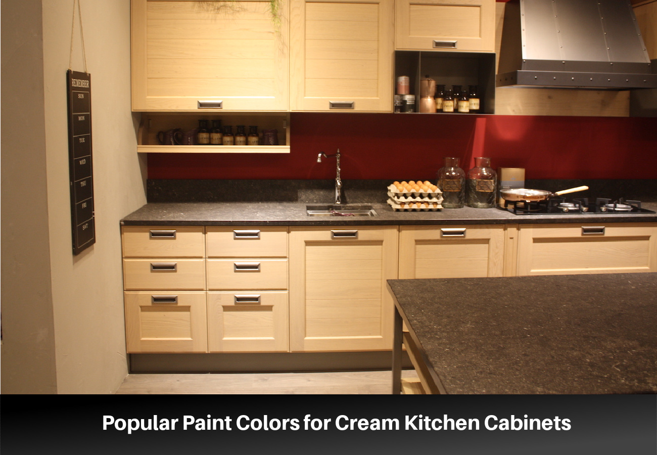
Cream is a neutral that is similar to white but softer and warmer and is among the wide variety of shades known as off-white. Cream leans toward the yellow side of off-white, similar to the color of dairy cream.
Cream tones range in how much yellow is present in the mix. In some cream paint combinations, yellow has a strong presence. In others, the yellow is subdued by the addition of cooling colors like gray or blue.
Popular Paint Colors for Cream Kitchen Cabinets
The trick when choosing the right cream is to consider the undertones of the color, the surrounding colors, the lighting sources in the room and the way these impact the color, and your personal preferences.
Creamy (7012) from Sherwin Williams
Creamy from Sherwin Williams is a popular cream for cabinetry of all kinds. It is a bright off-white with pale yellow undertones. It works best with warm tones, but its mild undertones can also pair well with cool colors.
Winterborne White (No. 239) from Farrow & Ball
Winterborne White is the ideal cream color for someone looking for a shade that is just a step away from white. This color is off-white with just a hint of yellow to warm it. This color pairs well with warm hues but looks equally gorgeous with gray or black.
White Down (CC-50) from Benjamin Moore
White Down is a cream with just a hint of gray and beige. These undertones create a color that pairs well with cooler shades.
Alabaster (7008) from Sherwin Williams
Alabaster is a warm off-white/light cream that is gorgeous on kitchen cabinets. It is light enough that it will look white in a dark-colored kitchen, but it looks cream compared with white. The undertones of this color are warm, but it is well-balanced enough that it works with a variety of color tones.
Pointing (No. 2003) from Farrow & Ball
Pointing takes its name from the lime pointing between traditional brickwork. True to its name, it has a delicate red undertone, which means that it works best with warm colors. This color takes on more body next to white but looks pale compared to stronger colors.
Natural Cream (OC-14) from Benjamin Moore
Natural Cream is a light and neutral cream. It is a balanced color with gray undertones. This color is so well balanced that though it has cool undertones, it works well with both cool and warm color schemes.
Shadow White (No. 282) from Farrow & Ball
Shadow White is off-white with just a hint of gray that looks like a white that is in a shady spot. This is a versatile color that takes on a stronger presence in darker rooms. This color works best with other colors that have a cool undertone.
Navajo White (6126) from Sherwin Williams
Navajo White from Sherwin Williams is a definite cream color with strong yellow undertones. Yet, it is light enough that it functions as an off-white rather than a yellow. Don’t confuse the Sherwin Williams’ Navajo White with the Benjamin Moore hue of the same name.
Tips for Choosing a Color for Cream Colored Cabinets
Painting your kitchen cabinets is a huge undertaking. Consider these six tips as you decide on the best color for your kitchen cabinets.
- Coordinate with other elements in the room – Before you choose a cream color for your cabinets, you need to consider all the other color elements in the room if you are not planning on changing them. Take into account the wall color, the appliances, the hardware finish, and other decorative materials such as countertops, backsplash, and lighting. For general purposes, if the colors of your materials lean warm, you should choose a cream color with pink or red undertones. For cool-colored accents, choose a cream color with gray, blue, or green undertones.
- Consider the lighting – Lights will dramatically change the perceived color of a space. A room with more natural light will make the color appear brighter and less saturated than in a dark room. Also, the color of your light bulbs will give your room a warmer or a cooler cast that will affect the way the cream color appears.
- Choose your kitchen materials before you select the cabinet color – This tip is for homeowners who are designing a kitchen from scratch. There are many gorgeous variations of cream that will work for your kitchen cabinets, but not as many countertop materials, floor colors, or backsplash options to consider. Before you choose a cream paint color for your cabinets, choose these kitchen accents. Once you have selected options for your countertops, backsplash, and floor, you can choose an appropriate cream paint color.
- Consider the depth of color – Cream paint colors range in the amount of color and depth they have. Some creams have just a hint of color while in others, the color is distinct. Choose the depth of color carefully and test a sample in your kitchen. Colors with yellow undertones will appear more yellow in dark rooms and under warm light. Rooms with large windows may wash out the color of pale creams and not provide enough body to give you the distinct cream look that you want.
- Think about your personal style – Your personal preferences should play a role in the cream color you choose. Cream paints with more intense yellow shading will work better in more traditional or classic room styles. Subtle cream colors work better with contemporary styles.
- Choose complementing colors – Cream works with a variety of other color tones but works best with natural colors. Consider pairing cream with other neutrals like black, brown, gray, and white. Cream also looks stunning with distinct colors like a wide variety of blues and green, blush pink, burnt sienna, and metallic tones.
Lookbook of Cream Kitchen Cabinet Ideas
A kitchen with cream cabinets works well in a variety of styles and contexts. We have gathered some kitchens that have cream colored cabinets so that you can see all the ways they can complement a kitchen space.
Modern Cream Kitchen Cabinets

Cream cabinets are as effective in a modern kitchen as they are in kitchens with a traditional style. You can use a simple cabinet style like a Shaker style for a modern classic look or a flat panel cabinet style for something more contemporary. Either way, cream gives a modern kitchen a welcoming but bright appearance and provides a slight but noticeable contrast with modern white walls.
Cream Cabinets with Black

Cream cabinets with black accents give your kitchen a look that is contemporary and luxurious. Consider adding dark accents to a kitchen with cream cabinets including dark countertops, flooring, or black hardware. This creates a style that is dramatic yet simple.
Cream Cabinets and Mixed Materials

Cream cabinets have a soft look that pairs well with a variety of materials and other colors. Consider pairing cream-painted cabinet units with sections of cabinets painted in complementing colors like deep green, blue, gray, and black. Add in wood elements like beam ceilings and countertops to give your kitchen depth and texture.
Cream Kitchen Cabinets and Metal Highlights

Cream, like other neutrals, works well with a variety of metal finishes. Cool creams work well with silver and chrome finishes, while warmer-toned creams look stunning with gold and brushed brass. Brass or gold hardware can bring out the glowing undertones of cream and give it a lush style.
White with Cream Colored Cabinets

Creating a light neutral kitchen with depth and texture requires planning. Layering white with cream-colored tones keeps the kitchen from appearing too cold and sterile. Mix in other light neutrals like taupe, beige, tan, and almond to create even more contrast and interest.

